Flashbacks: We decided for the flashback we wanted the colours to be bright and vibrant very juxtaposed to the current time. This will make the flashbacks obvious therefore cutting down the confusion when jumping between time frames.
This is the original film without any effect, although the colours are bright it doesn't give the effect that we wanted. The colours are quite dull as it was filmed on a cold wet day therefore we need to give it some brightness as though its sunny to create pathetic fallacy with the characters
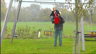
This is the hue and saturation effect gives the greens and reds extra colour however it doesn't effect all the colours in the frame which we want. The red on the girls dress is very vibrant but then the red on the swings aren't as bright which makes it obvious that it's been edited
This is film grain for our group this aged the frame instead of making it more vivid and bright. The colours are very dull which is very juxtaposed to what we want. Therefore we wont be using this effect
We finally decided to use this effect of teal and orange as it gave the whole of the frame brighter colour and made the characters stand out against the background. Having everything brighter makes it look more realistic as though it hasn't been edited. That's why we are using this effect


No comments:
Post a Comment